Introduction to Typography in Graphic Design
Typography is a fundamental element in graphic design, significantly influencing the overall aesthetics, readability, and effectiveness of a design. It encompasses the art and technique of arranging type, including the selection of fonts and typefaces, to convey a message clearly and appealingly. Good typography can make a design look professional, while poor typography can detract from its intended impact.
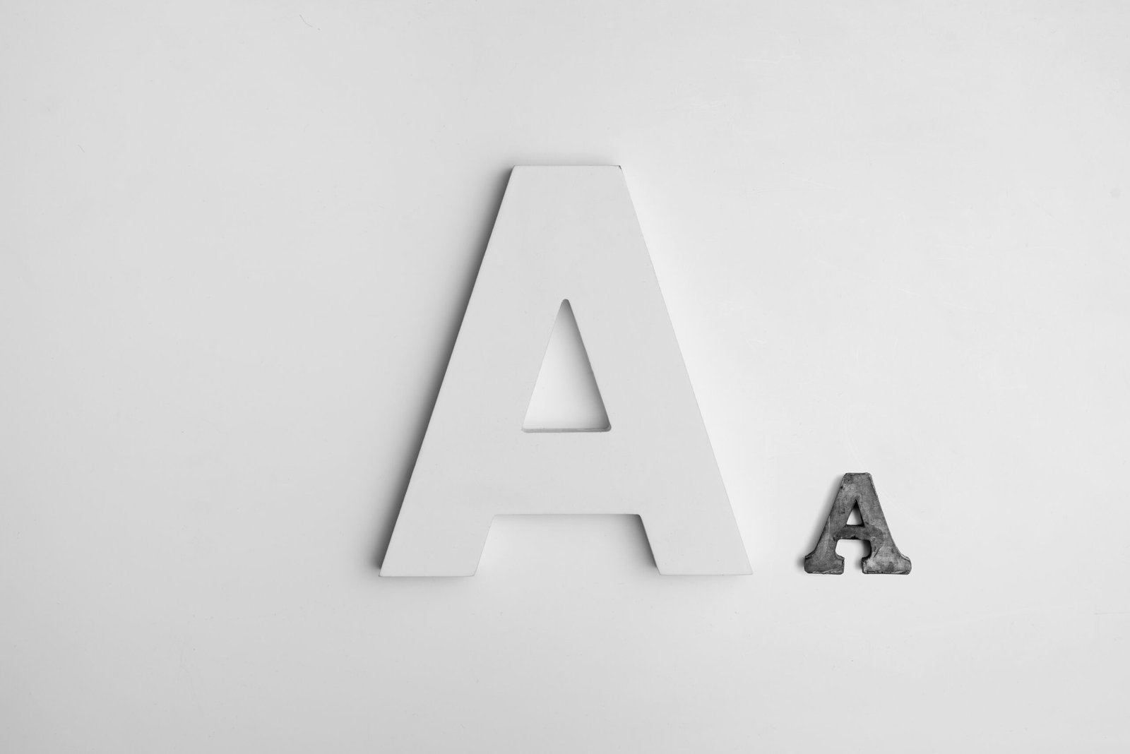
Fonts and typefaces are critical components in typography. While the terms are often used interchangeably, they have distinct meanings. A typeface refers to a family of related fonts, whereas a font is a specific style, weight, and size within that family. For instance, Arial is a typeface, while Arial Bold, Arial Italic, and Arial Regular are different fonts within that typeface family. The choice of fonts and typefaces can set the tone for the design, providing cues about the subject matter and intended audience.
Beyond aesthetics, typography plays a crucial role in readability. The right combination of fonts, spacing, and alignment can make text easy to read and understand, which is essential for effective communication. Factors such as line height, letter spacing, and paragraph spacing must be carefully considered to ensure that the text is legible and pleasant to the eye. Overly complex or decorative fonts may look appealing but can hinder readability if not used judiciously.
Typography also has an emotional impact, as different styles evoke different feelings and responses. Serif fonts, like Times New Roman, often convey a sense of tradition and reliability, making them suitable for formal documents and academic papers. On the other hand, sans-serif fonts, like Helvetica, present a modern and clean appearance, ideal for contemporary designs and digital interfaces. Script and decorative fonts can add a personal touch or a sense of whimsy but should be used sparingly to avoid overwhelming the design.
In conclusion, understanding typography in graphic design is crucial for creating visually appealing and effective designs. By thoughtfully selecting and arranging fonts and typefaces, designers can enhance the overall aesthetics, improve readability, and convey the desired emotional impact.
Choosing the Right Typeface
Selecting the appropriate typeface is an essential aspect of effective graphic design. Typefaces can be broadly categorized into four primary types: serif, sans-serif, script, and decorative. Each of these categories serves unique purposes and conveys different messages, making the selection process pivotal to the overall impact of the design.
Serif typefaces, characterized by the small lines or strokes regularly attached to the end of a larger stroke in a letter, are often associated with tradition, reliability, and formality. Common examples include Times New Roman and Georgia. These typefaces are ideal for projects requiring a touch of elegance and readability, such as printed materials, books, and formal documents.
Sans-serif typefaces, on the other hand, do not include the small projecting features found on serif fonts. This simplicity lends a modern, clean, and straightforward feel to the text. Fonts like Arial and Helvetica fall into this category. Sans-serif typefaces are frequently used for digital content, headlines, and any design where readability and clarity are paramount, especially on screens.
Script typefaces mimic handwritten text and can range from casual and playful to formal and elegant. They are often used to add a personal touch or elegance to a design. Examples include Brush Script and Lobster. While script fonts can be visually appealing, they should be used sparingly and are best suited for invitations, greeting cards, and branding materials that seek to convey a more personalized or sophisticated message.
Decorative typefaces, also known as display typefaces, are designed to attract attention and are often highly stylized. They are perfect for logos, posters, and any design element where making a strong visual statement is the goal. However, they should be used judiciously, as overuse can easily overwhelm the viewer and detract from the message.
When choosing the right typeface, consider the design’s purpose, target audience, and the message you wish to convey. A thoughtful selection can significantly enhance the effectiveness of your graphic design, ensuring it resonates well with the intended audience and communicates the desired tone succinctly.
Pairing Fonts Effectively
In the realm of graphic design, the art of pairing fonts is instrumental in achieving visual harmony and contrast. Effective font pairing involves the thoughtful combination of different typefaces to create a cohesive and aesthetically pleasing design. To master this skill, designers must understand a few fundamental principles.
Firstly, it’s essential to establish a clear hierarchy. Hierarchy refers to the arrangement of elements in a way that signifies their importance. By using distinct fonts for headings, subheadings, and body text, designers can guide the viewer’s eye and emphasize critical information. For instance, pairing a bold, sans-serif font for headings with a more subdued serif font for body text can create a balanced and readable design.
Another key principle is contrast. Contrasting fonts can make a design more dynamic and captivating. This contrast can be achieved through differences in weight, style, and size. For example, a delicate script font paired with a robust slab serif can draw attention to specific elements while maintaining readability.
When pairing fonts from different families, it’s beneficial to look for complementary characteristics. Fonts that share similar proportions, x-heights, or stroke contrasts tend to work well together. For instance, the modern sans-serif font Helvetica can be paired effectively with the classic serif font Garamond. This combination blends contemporary and traditional elements, yielding a sophisticated and timeless look.
Additionally, designers should be cautious with the number of fonts they use. Limiting a design to two or three typefaces prevents visual clutter and ensures cohesion. Experimenting with different weights and styles within the same font family can also add variety without overwhelming the viewer.
Examples of well-paired fonts include pairing Futura, a geometric sans-serif, with Times New Roman, a reliable serif font. The clean lines of Futura provide a modern touch, while Times New Roman offers readability and sophistication. Another effective pair is Montserrat, a contemporary sans-serif, with Merriweather, a serif font designed for on-screen readability, offering a balance of modernity and tradition.
In conclusion, understanding the principles of hierarchy, contrast, and complementary characteristics can help designers pair fonts effectively, enhancing the overall impact of their graphic design projects.
Understanding and Using Hierarchy
Typographic hierarchy is a fundamental principle in graphic design that guides the viewer’s eye through the content in a structured and logical manner. By employing size, weight, and spacing effectively, designers can create a clear visual hierarchy that assists in prioritizing information and emphasizes the most important elements on a page.
Size is one of the most straightforward ways to establish a typographic hierarchy. Larger text naturally draws more attention and can be used for headings and key messages. Conversely, smaller text is suitable for less critical information, such as body copy and footnotes. By varying text sizes, designers can create a layered visual experience that intuitively directs the viewer’s attention.
In addition to size, weight plays a crucial role in typographic hierarchy. Bold or heavy fonts can make certain elements stand out, signaling their importance. Using lighter weights for secondary information helps maintain a balanced and readable layout. Combining different weights within the same type family can achieve a cohesive yet dynamic look, enhancing the overall readability and impact of the design.
Spacing, or the white space around text elements, is another powerful tool for establishing hierarchy. Adequate spacing between lines (leading) and characters (kerning) improves legibility and creates a clean, organized appearance. More generous spacing around headings and key points can isolate them from surrounding content, making them more prominent and easier to spot.
To effectively prioritize information, start by identifying the most critical messages that need to stand out. Use larger sizes, heavier weights, and strategic spacing to highlight these elements. Secondary information should be styled in a way that supports the primary content without competing for attention. Consistency is key; maintaining a uniform approach to hierarchy throughout the design ensures that the viewer can easily navigate and comprehend the material.
By mastering the use of size, weight, and spacing, designers can craft visually appealing and functional layouts that communicate information clearly and effectively. Understanding and applying typographic hierarchy not only enhances the aesthetic quality of the design but also significantly improves the overall user experience.
The Role of White Space
White space, often referred to as negative space, is a crucial element in typography and graphic design. Its significance cannot be overstated, as it plays a pivotal role in enhancing readability and drawing attention to key elements within a design. By strategically incorporating white space, designers can create a balanced, clean, and professional look that effectively communicates the intended message.
One of the primary benefits of white space is its ability to improve readability. In typography, cluttered text can overwhelm the reader and deter them from engaging with the content. Adequate white space around text blocks, between paragraphs, and within line spacing allows the eyes to rest and facilitates a smoother reading experience. This not only makes the text more inviting but also ensures that the message is conveyed clearly and efficiently.
Furthermore, white space serves as a powerful tool for highlighting key elements of a design. By isolating important information, such as headings, subheadings, or call-to-action buttons, designers can guide the viewer’s attention and emphasize focal points. This technique creates a visual hierarchy, making it easier for the audience to navigate and understand the content.
To achieve a harmonious balance between text and white space, designers should consider several strategies. First, it’s essential to prioritize content by determining which elements are most important and deserve more attention. Once the hierarchy is established, generous margins and padding can be applied to separate different sections and prevent overcrowding.
Another effective approach is to use grids and alignment principles to organize content systematically. Grids help maintain consistency in spacing and alignment, ensuring that white space is evenly distributed throughout the design. Additionally, designers should resist the temptation to fill every inch of the layout with text or images. Embracing minimalism and allowing ample white space can lead to a more polished and sophisticated appearance.
In conclusion, white space is an indispensable aspect of typography that enhances readability, emphasizes key elements, and contributes to a clean and professional design. By thoughtfully balancing text and white space, designers can create visually appealing and effective graphic designs.
Kerning, Leading, and Tracking
In the realm of typography, kerning, leading, and tracking are fundamental elements that significantly influence the readability and overall appearance of text. Understanding and effectively manipulating these aspects can elevate the quality of graphic design work.
Kerning refers to the adjustment of space between individual characters in a word. Proper kerning ensures that the spacing between letters is visually appealing and cohesive, preventing awkward gaps or overly tight positioning that can disrupt the flow of text. For instance, in a logo design, precise kerning can enhance the legibility of the brand name, making it more memorable and professional.
Leading, on the other hand, is the vertical space between lines of text. Adequate leading is crucial for readability, especially in body text. If the leading is too tight, the lines can appear cramped, making it difficult for the reader to follow the text. Conversely, too much leading can cause the text to appear disjointed. By striking a balance, designers can ensure that paragraphs are easily scanned and digestible, contributing to a more pleasant reading experience.
Tracking involves adjusting the overall spacing between characters in a block of text. Unlike kerning, which deals with individual character pairs, tracking uniformly increases or decreases the space across a range of characters. This can be particularly useful in adjusting the density of text to fit a particular design space or to achieve a specific aesthetic effect. For example, increasing tracking can give a clean, airy feel to a design, while reducing it can create a more compact, intense look.
Practical application of these elements requires a keen eye for detail. Visual examples demonstrate that even minor adjustments in kerning, leading, and tracking can make a substantial difference. By refining these typography elements, designers can enhance both the function and form of their text, ensuring it not only conveys the intended message but does so in a visually harmonious way.
Color and Contrast in Typography
Color and contrast play a critical role in typography, directly influencing the readability and aesthetic appeal of a design. Proper color selection can enhance the overall visual experience, making the text not only legible but also engaging. Understanding the basics of color theory is essential for any graphic designer aiming to create harmonious and effective typography.
Color theory is the foundation of color selection. Complementary colors, which are opposite each other on the color wheel, create a vibrant look when paired together. For instance, placing blue text on an orange background can make the text pop. However, using complementary colors requires careful balancing to avoid visual strain. Analogous colors, which are next to each other on the color wheel, provide a more harmonious and subtle look. This method is ideal for designs that aim for a more cohesive and soothing effect.
Contrast, on the other hand, is crucial for readability. High contrast between text and background ensures that the content is easily discernible. Black text on a white background offers the highest level of contrast, but other combinations can work effectively too. Low contrast, such as light gray text on a white background, can cause readability issues and should generally be avoided in body text.
When choosing colors for typography, it is important to consider the overall design’s mood and purpose. Warm colors like reds and oranges can convey energy and urgency, while cool colors like blues and greens can evoke calmness and professionalism. The chosen colors should align with the intended message and audience of the design.
In summary, mastering the use of color and contrast in typography can significantly enhance the readability and visual appeal of a design. By understanding color theory and applying it thoughtfully, designers can create compelling and effective typographic compositions.
Common Typography Mistakes to Avoid
Typography is a fundamental aspect of graphic design that can significantly impact the effectiveness and aesthetics of your work. However, several common mistakes can undermine your efforts. Understanding and avoiding these pitfalls is crucial for creating visually appealing and effective designs.
One frequent mistake designers make is using too many fonts in a single project. While it might seem creative, it often results in a cluttered and confusing design. To avoid this, limit your font usage to two or three complementary typefaces. Consistency in font choice enhances readability and ensures a cohesive look.
Poor font pairing is another prevalent issue. Combining fonts that clash can make your design look unprofessional. To achieve good font pairing, choose fonts with contrasting characteristics but similar moods. For instance, pairing a serif font with a sans-serif font can create an appealing balance. Utilize online tools and resources that suggest harmonious font pairs to guide your choices.
Ignoring typographical hierarchy is a significant mistake that compromises the flow and structure of your design. Hierarchy helps guide the reader’s eye through the content in a logical manner. Ensure that headings, subheadings, and body text are distinctly different in size, weight, or style. This differentiation makes it easier for readers to navigate the content and understand its importance.
Inadequate contrast between text and background can severely affect readability. Low contrast makes text difficult to read, especially for those with visual impairments. To ensure sufficient contrast, use tools like color contrast checkers to evaluate the legibility of your text against the background. Aim for a high contrast ratio to enhance readability and accessibility.
By recognizing and correcting these common typography mistakes, you can significantly improve the quality of your graphic design projects. Always strive for simplicity, readability, and visual harmony to create engaging and effective designs.