Understanding the Purpose of a Logo
A logo serves as a pivotal element in establishing a brand’s identity, acting as the visual cornerstone that embodies the essence of the company. The primary function of a logo is to create a unique brand identity that distinguishes the company in a crowded marketplace. Through distinctive design elements, such as color, typography, and imagery, a logo encapsulates the personality and values of a brand, making it instantly recognizable to consumers.
Recognition is another critical function of a logo. A well-designed logo enables quick and effortless identification of the brand, fostering familiarity and loyalty among consumers. Think of iconic logos like the Nike swoosh or Apple’s apple—these symbols are immediately associated with their respective brands, illustrating the power of effective logo design in achieving brand recognition.
Moreover, a logo serves to convey a company’s values and mission succinctly. It is not merely an aesthetic feature but a strategic tool that communicates what the brand stands for. For instance, a logo designed for an eco-friendly company might incorporate elements of nature, reflecting its commitment to sustainability. This visual representation of the company’s ethos helps consumers connect with the brand on a deeper level.
In essence, a logo is a crucial component of a brand’s visual identity, acting as the face of the company across various platforms. Whether it appears on business cards, websites, social media profiles, or product packaging, the logo is a consistent visual cue that ties all brand communications together. It is the first impression that consumers have of a brand, making its design a critical aspect of overall branding strategy.
Research and Inspiration
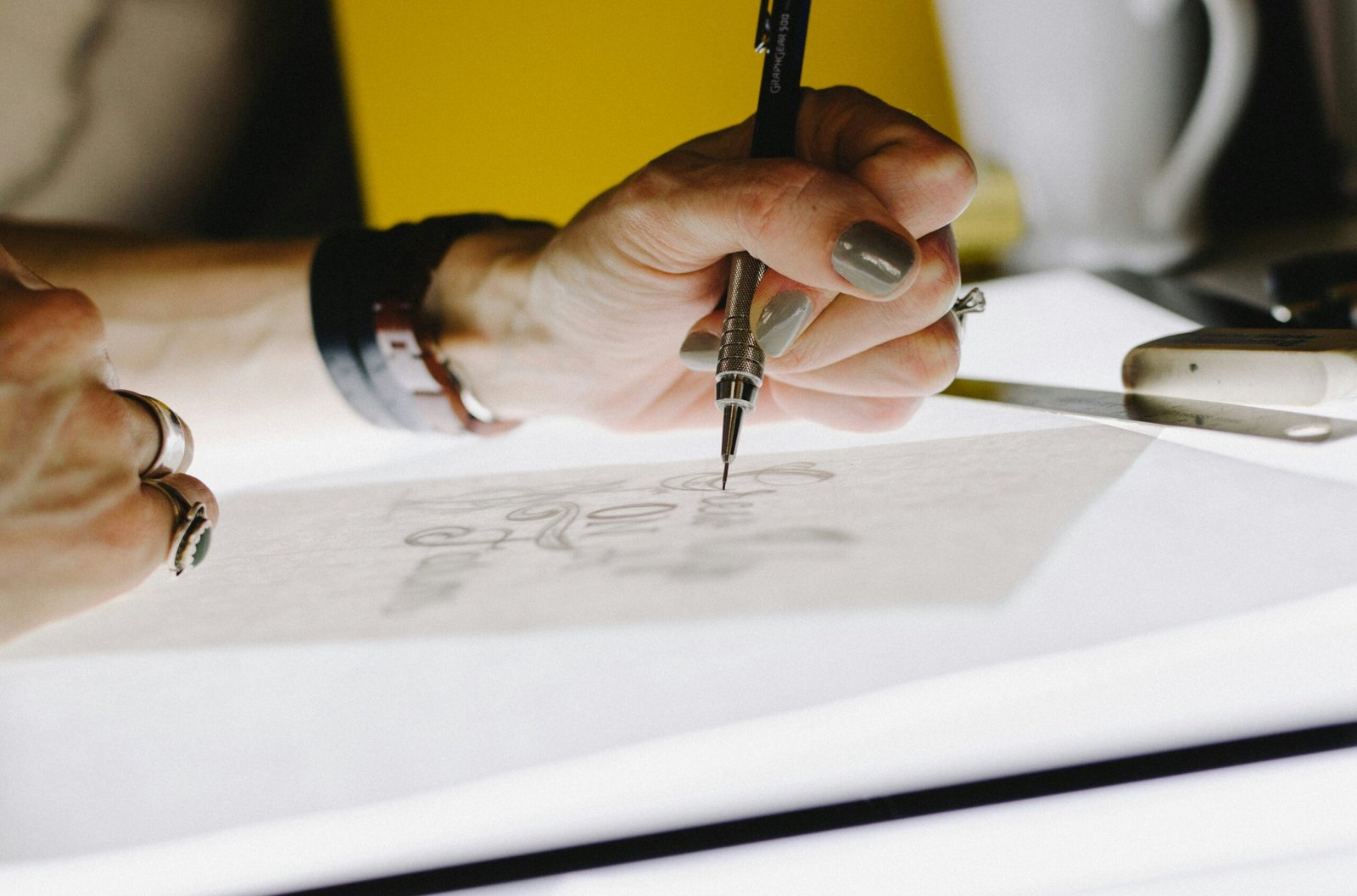
When embarking on the journey of creating a logo, thorough research is a fundamental first step. Understanding the industry, target audience, and competitors is crucial in ensuring the logo accurately represents the brand’s identity and resonates with its intended market. Diving deep into industry specifics allows designers to comprehend the common visual language and trends that appeal to the target demographic.
Analyzing competitors’ logos provides valuable insights into what works and what doesn’t within a particular niche. This analysis can highlight gaps and opportunities for differentiation, enabling the creation of a unique and memorable logo. It is essential to not only examine direct competitors but also look at indirect competitors and even companies in other industries for broader inspiration.
Gathering inspiration from existing logos and design trends can spark creativity. Platforms like Pinterest, Behance, and Dribbble are treasure troves of design examples that showcase a wide array of styles and concepts. While it’s important to be inspired, designers must avoid imitation and strive for originality to ensure the brand stands out.
Creating a mood board is an effective way to collect and organize ideas. A mood board can include various visual elements such as color palettes, typography options, and illustrative styles that align with the brand’s vision. This collage of inspiration serves as a visual reference throughout the design process, helping to maintain consistency and focus.
In summary, comprehensive research and thoughtful inspiration gathering are indispensable steps in the logo design process. By understanding the industry landscape, analyzing competitors, and curating a mood board, designers set a solid foundation for creating logos that are not only visually appealing but also strategically aligned with the brand’s goals.
Simplicity and Versatility
In the realm of logo design, simplicity stands as a cornerstone principle. A simple logo is more likely to be easily recognizable and memorable, which is crucial in a world where consumers are constantly bombarded with visual stimuli. The effectiveness of simplicity lies in its ability to convey a brand’s essence without overwhelming the viewer. Simple logos are more likely to be versatile, maintaining their integrity across various applications and mediums.
Versatility is another critical aspect of successful logo design. A versatile logo retains its effectiveness whether it’s scaled down to fit on a business card or enlarged for a billboard. It should also look good in different formats, from digital screens to print media. Additionally, the logo must remain impactful regardless of the background it is placed on, whether that be a colored background, a textured surface, or a transparent overlay.
Consider the iconic logos of global brands such as Apple, Nike, and McDonald’s. The Apple logo, with its sleek and straightforward silhouette, works seamlessly across a range of sizes and backgrounds. Nike’s swoosh is another excellent example; it’s instantly recognizable and maintains its visual appeal whether it’s embroidered on a sneaker or displayed on a website. McDonald’s golden arches are equally adaptable, easily identifiable on everything from packaging to large-scale signage.
These examples illustrate the power of combining simplicity with versatility in logo design. By focusing on these principles, designers can create logos that stand the test of time and remain effective across a myriad of uses. This approach not only enhances brand recognition but also ensures that the logo remains functional and visually appealing in various contexts.
Choosing the Right Colors
Understanding the impact of color psychology is crucial when designing a logo. Colors have the power to evoke specific emotions and associations, making them a vital element in communicating a brand’s message. For instance, blue often conveys trust and professionalism, making it a popular choice for financial institutions. Red, on the other hand, can evoke excitement and urgency, which is why it is frequently used in the food and beverage industry. Yellow is associated with optimism and energy, often appealing to a younger audience or brands that wish to appear cheerful and welcoming.
When selecting a color palette for a logo, it’s essential to consider the brand’s message and target audience. A well-chosen color scheme can enhance brand recognition and loyalty. Start by identifying the core values and emotions the brand wants to convey. For example, a luxury brand might opt for a sophisticated palette with black, gold, or deep purples, while an eco-friendly brand might choose greens and earth tones to reflect sustainability.
It’s also important to maintain color consistency across all branding materials. Consistency helps to establish a strong visual identity and ensures that the brand is easily recognizable in different contexts. Once the primary colors are chosen, create a style guide that outlines the specific shades and their usage. This guide should be followed in all marketing materials, from business cards and websites to social media profiles and advertisements.
Additionally, consider the cultural implications of color in different regions if the brand operates internationally. Colors can have varied meanings across cultures, and what works well in one country might not resonate in another. Conducting thorough research or consulting with a local expert can help avoid potential misinterpretations.
By carefully choosing and consistently applying the right colors, you can significantly enhance the effectiveness of your logo and reinforce the overall brand identity.
Typography Matters
Typography plays a pivotal role in logo design, as the choice of fonts can significantly influence the logo’s overall feel and message. Selecting the right typography is crucial in ensuring that the logo aligns with the brand’s identity and effectively communicates its values and personality. A well-chosen font can evoke specific emotions and create a lasting impression on the audience.
When selecting fonts, it’s essential to consider the brand’s identity and the message it aims to convey. For instance, a modern and sleek sans-serif font may be suitable for a tech company, while a classic serif font might be more appropriate for a law firm. The font should complement the logo’s design and harmonize with other visual elements, such as icons or symbols.
Readability is another critical factor in typography selection. A logo should be easily recognizable and legible, even at smaller sizes or from a distance. Avoid overly complex or trendy fonts that may compromise readability or become outdated quickly. Simple and clean fonts are often more effective in maintaining clarity and versatility across various mediums and applications.
Additionally, it’s important to limit the number of fonts used in a logo. Using too many different fonts can create a cluttered and unprofessional appearance. Generally, sticking to one or two complementary fonts is advisable to maintain a cohesive and polished look.
In conclusion, typography is a fundamental aspect of logo design that can greatly impact the overall effectiveness and aesthetic appeal of a logo. By carefully selecting fonts that align with the brand’s identity, ensuring readability, and keeping the design simple and timeless, designers can create logos that stand out and make a lasting impression.
Balancing Elements and Composition
When designing a logo, achieving balance and composition is critical to creating a cohesive and visually appealing result. Balance in design refers to the distribution of visual weight within the logo. This can be achieved through symmetry, asymmetry, or radial balance, ensuring that no part of the logo overpowers the others. Symmetry involves mirroring elements on either side of an axis, creating a harmonious and stable appearance. Asymmetry, on the other hand, uses different visual elements to balance each other through contrast and dynamic composition.
Proportion is another fundamental aspect of balance. It involves the relative size and scale of elements within the logo. Proper proportion ensures that no single element dominates the design unless intended for emphasis. For instance, the size of an icon relative to the text can impact readability and overall aesthetic. A well-proportioned logo maintains a natural flow and guides the viewer’s eye seamlessly across the design.
Arranging elements harmoniously requires a keen eye for detail. Elements such as icons, typography, and color blocks should complement each other rather than compete for attention. Utilizing grids can help in aligning elements cohesively, maintaining uniform spacing, and ensuring a polished look. Additionally, the use of negative space can enhance balance by preventing clutter and giving the design room to breathe.
Examples of well-balanced logos include the Apple logo, which uses symmetrical balance to create a clean and elegant design, and the Nike swoosh, which employs asymmetry to convey motion and energy. Common mistakes to avoid include overcrowding elements, which can lead to visual chaos, and ignoring the importance of alignment, resulting in a disjointed appearance.
Ultimately, mastering balance and composition in logo design is a blend of art and science. By adhering to these principles, designers can craft logos that are not only aesthetically pleasing but also functional and memorable.
Testing and Feedback
Testing a logo with various audiences and gathering feedback is a crucial step in the design process. This phase ensures that the logo resonates well with its intended audience and effectively communicates the brand’s message. To achieve this, designers can employ several methods such as focus groups, surveys, and A/B testing.
Focus groups involve selecting a diverse group of individuals who represent the target audience. By presenting the logo to these focus groups, designers can observe participants’ reactions and solicit detailed feedback. This qualitative data helps identify elements of the logo that are well-received and aspects that may need adjustment.
Surveys, on the other hand, provide a quantitative approach to gathering feedback. Designers can distribute surveys to a broad audience, asking specific questions about the logo’s appeal, clarity, and relevance. This method allows for the collection of a larger volume of responses, providing a comprehensive understanding of the logo’s effectiveness across different demographics.
A/B testing is another valuable method where two versions of the logo are presented to different segments of the audience. By comparing the responses to each version, designers can determine which design performs better in terms of recognition, recall, and overall preference. This data-driven approach offers concrete evidence on which design elements are most effective.
Once feedback is collected through these methods, it is essential to analyze the data and identify common themes and suggestions. Constructive criticism should be used to refine and improve the logo design. This iterative process may involve adjusting colors, typography, or layout to better align with audience preferences and enhance the logo’s impact.
Ultimately, testing and feedback are invaluable tools in the logo design process. They provide insights that help designers create logos that not only look aesthetically pleasing but also effectively communicate the brand’s identity and values to its target audience.
Finalizing and Delivering the Logo
Upon reaching the final stages of logo design, it is imperative to ensure that all elements align with the client’s vision and requirements. A comprehensive approach to finalizing the logo involves creating various versions tailored for different uses. This entails designing a full-color version, a black and white iteration, and an icon-only variant. Each version serves a unique purpose, ensuring the logo remains versatile and effective across multiple contexts, including digital platforms, print media, and promotional materials.
Equally important is the development of a detailed style guide. This document acts as a roadmap for the consistent application of the logo across various mediums. It should encapsulate logo usage guidelines, specifying appropriate contexts for each version of the logo. Additionally, the style guide must include precise color codes for the primary and secondary color palettes, ensuring color fidelity in both digital and print formats. Typography guidelines are also crucial, as they dictate the fonts and text styles that complement the logo, maintaining a cohesive brand identity.
Delivering high-quality files in multiple formats is another critical aspect of the finalization process. Providing the client with logo files in versatile formats such as PNG, SVG, and EPS guarantees that the logo can be utilized effectively in various applications. PNG files are suitable for web use due to their high resolution and transparency features. SVG files, being scalable vector graphics, ensure that the logo retains its quality at any size, making them ideal for responsive design. EPS files are preferred for print due to their compatibility with professional printing equipment, ensuring the highest quality reproduction.
In conclusion, the process of finalizing and delivering a logo involves meticulous attention to detail and a commitment to providing clients with versatile, high-quality assets. By creating multiple logo versions, developing a comprehensive style guide, and delivering files in various formats, designers can ensure that the logo serves its purpose effectively across all intended platforms and applications.